Natalie Cavalcante
A welcoming digital experience that combines clarity, visual identity and intuitive navigation.
Built by Tatuí Tech and shown with the client's permission.
Context
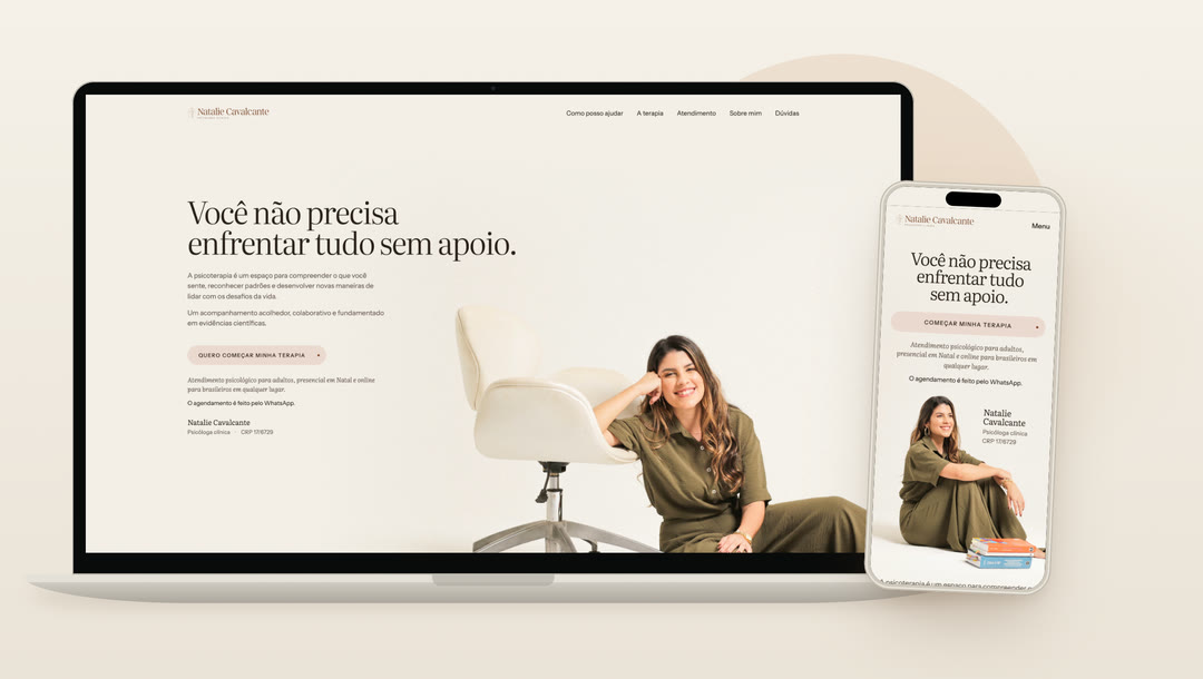
A website for a clinical psychologist in Natal, in Rio Grande do Norte, Brazil, built around one idea: getting closer. Art direction, UX, a design system and the front end, made without promises, urgency or invented testimonials.
The previous site was WordPress with Elementor. The new one was rewritten from content to interface: one page, eight chapters and a clear invitation to start therapy.
What we did
Identity and art direction
Literata and Instrument Sans, a palette of paper, sand, terracotta and olive, and portraits from an editorial shoot.
Information architecture
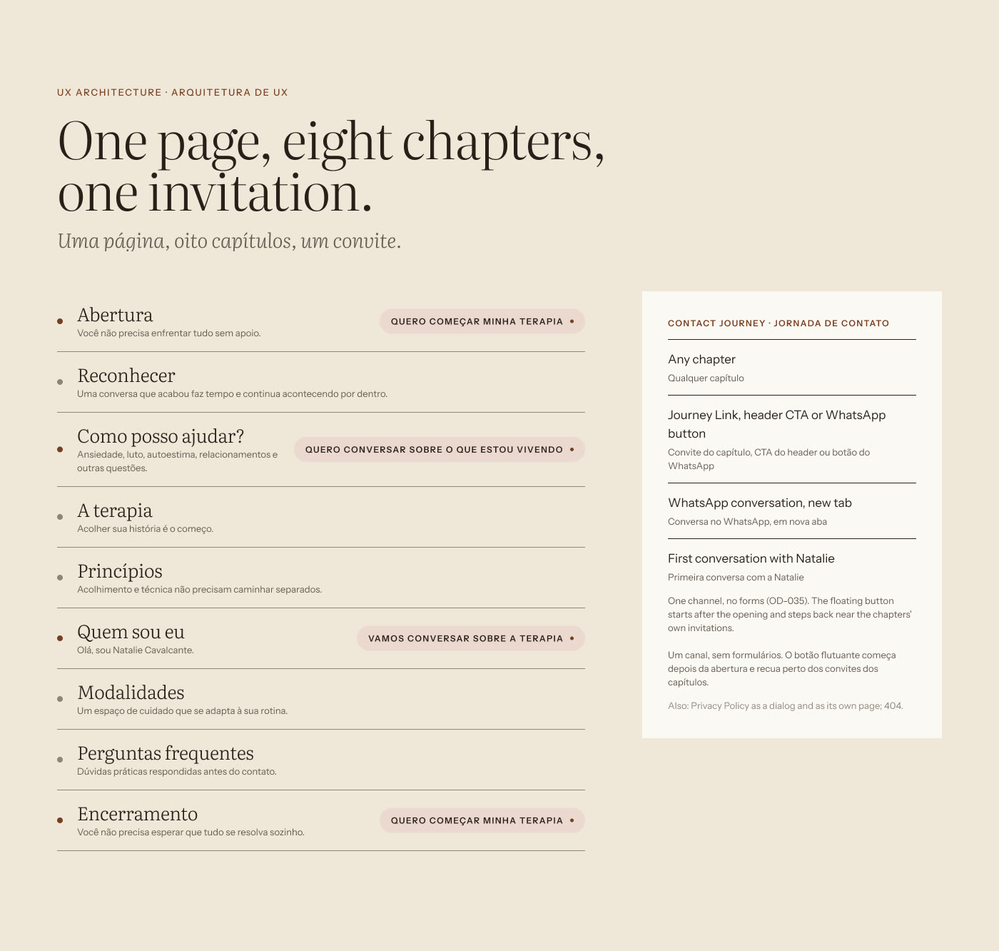
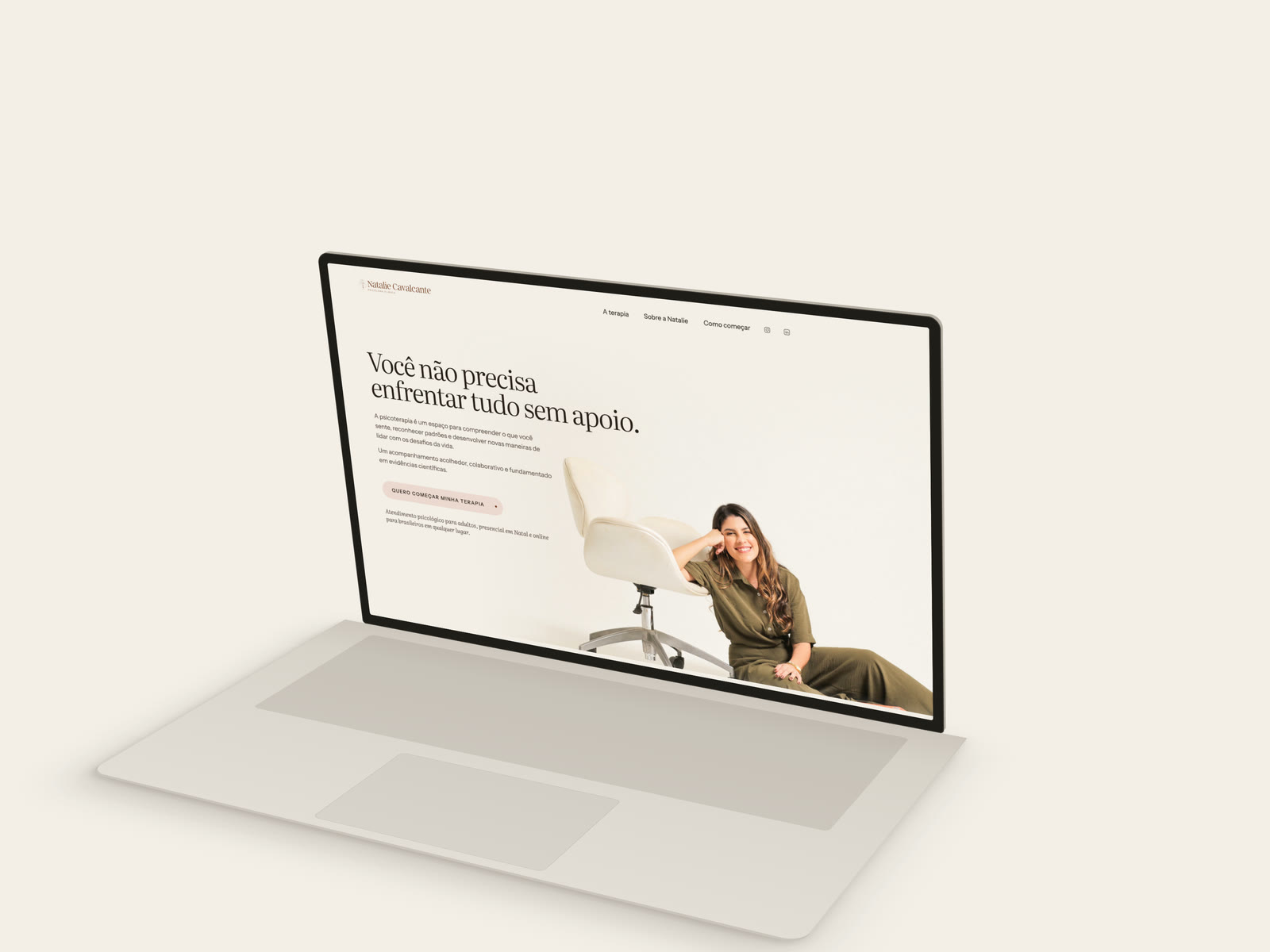
One page in eight chapters, from the first moment of recognition to the invitation to begin, with booking on WhatsApp.
Design system
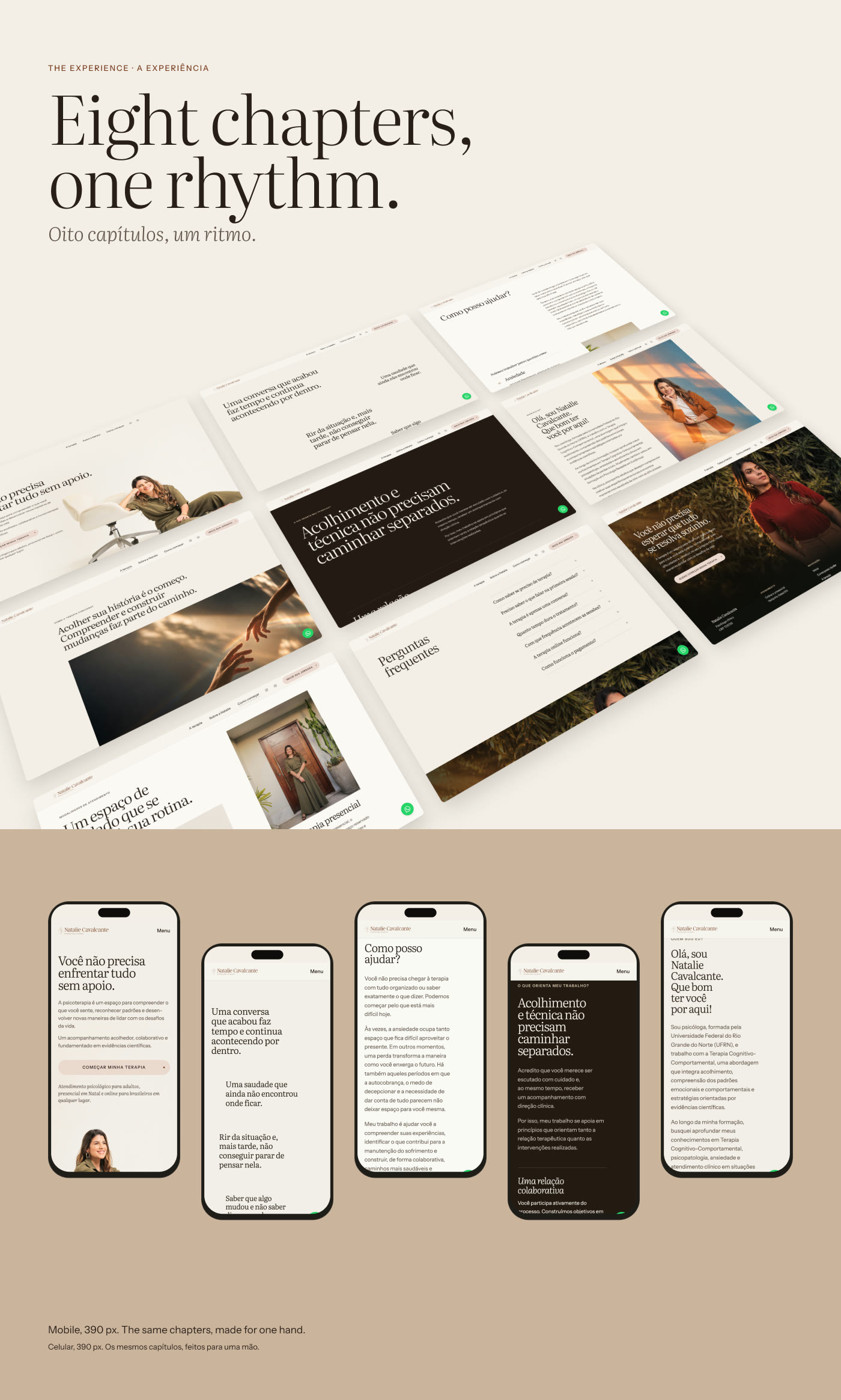
112 variables in 6 collections, 5 layout modes from 320 to 1440 px and 14 text styles, with the same names in Figma and in code.
Motion and microinteractions
Motion as attention: the main button flips, the header compacts and the questions open. With reduced motion, everything stays still.
Accessibility
WCAG 2.2 AA as a requirement: reflow at 320 px, keyboard navigation and visible focus.
Information architecture
One page, eight chapters, one invitation. Each chapter answers a question a visitor brings, in the order it usually comes up.
Identity and design system
A system with one gesture: the variables mirror the code tokens one to one, with the same names, and the same invitation component runs through the whole site.
Desktop experience
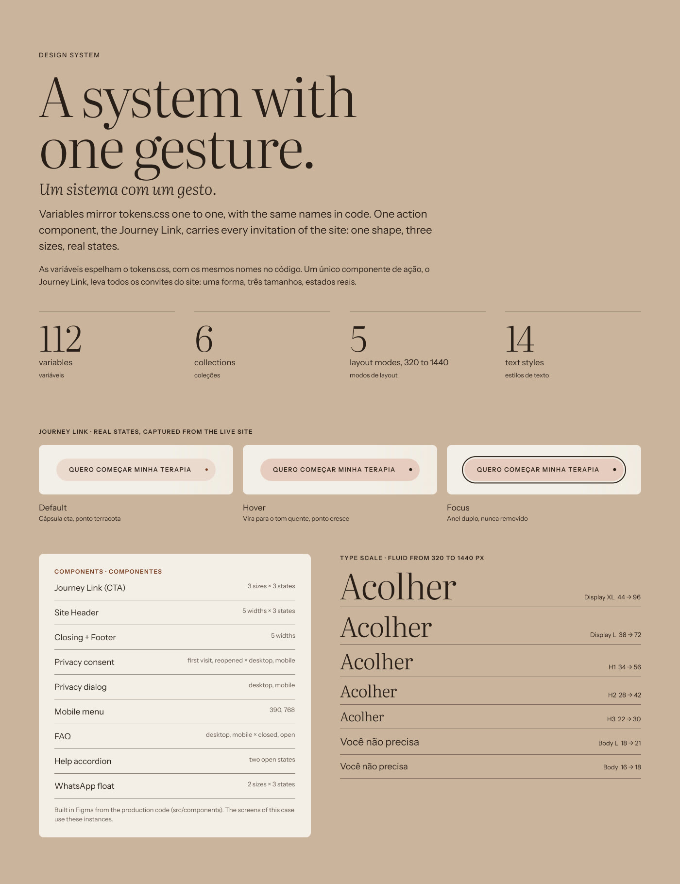
Editorial rhythm and room to breathe: serif headings, short texts and the portrait anchoring each chapter.
Mobile experience
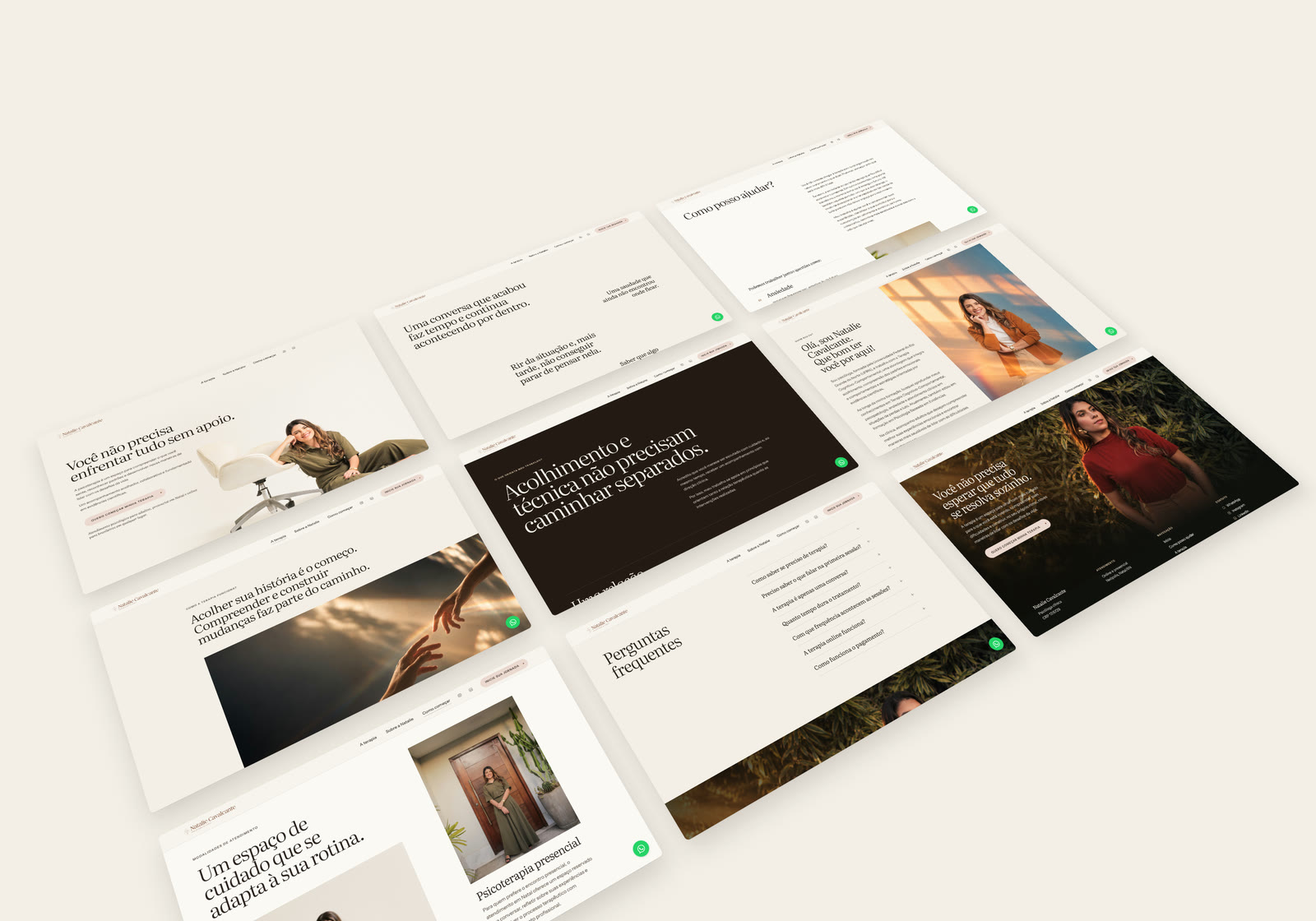
The same chapters, recomposed for one hand: a simple menu, the invitation always within reach and booking on WhatsApp.
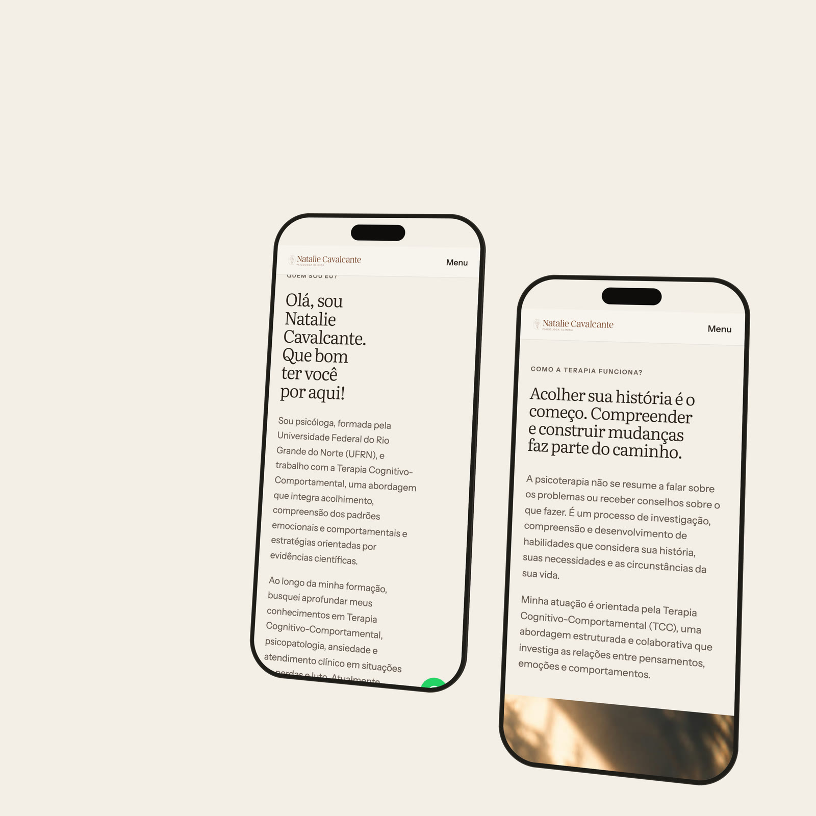
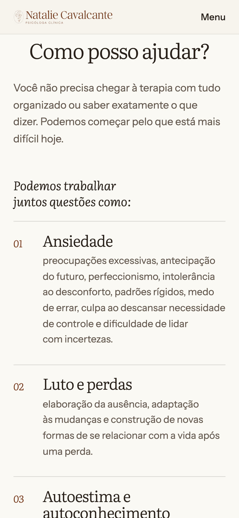
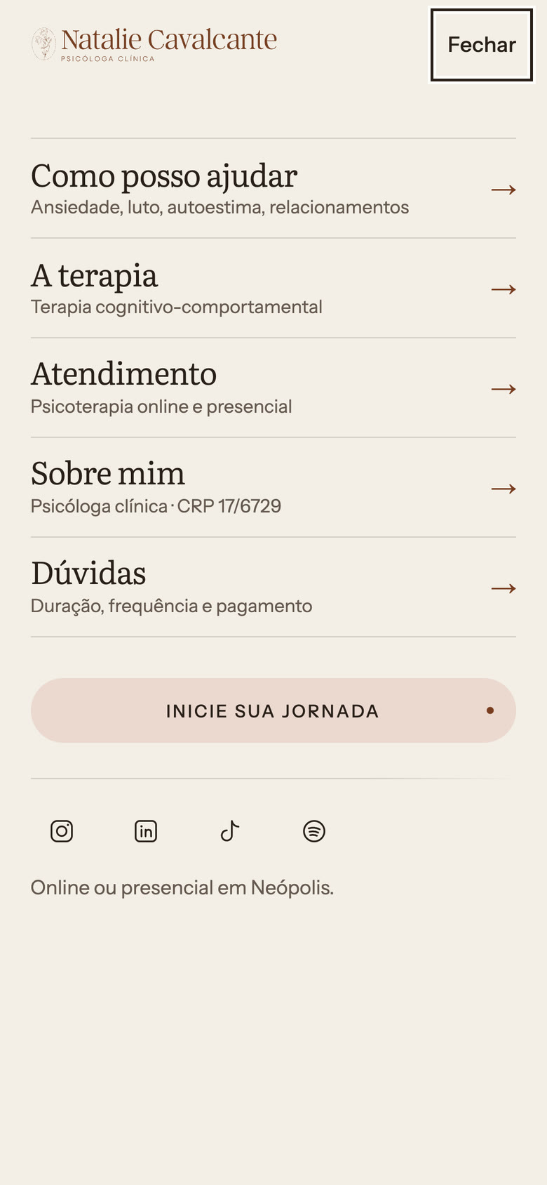
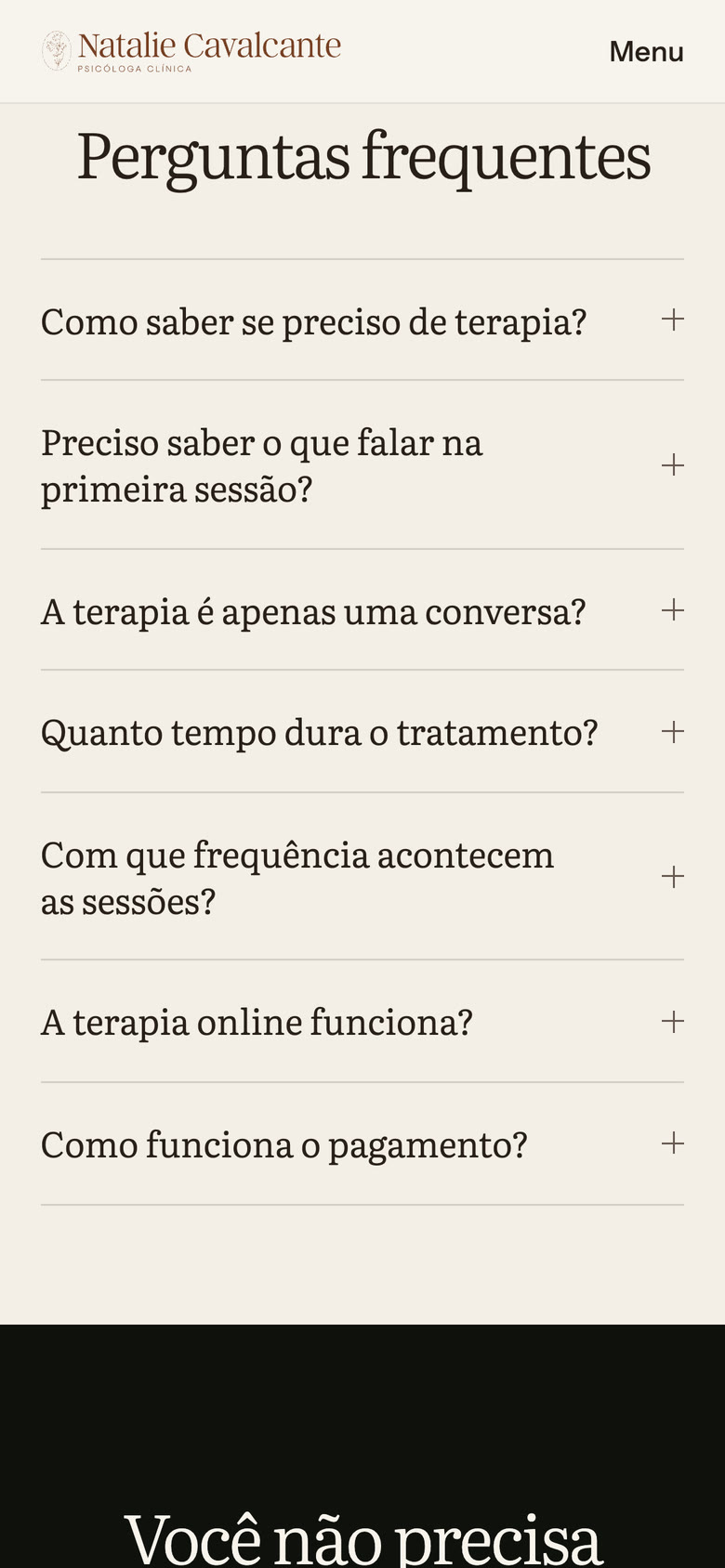
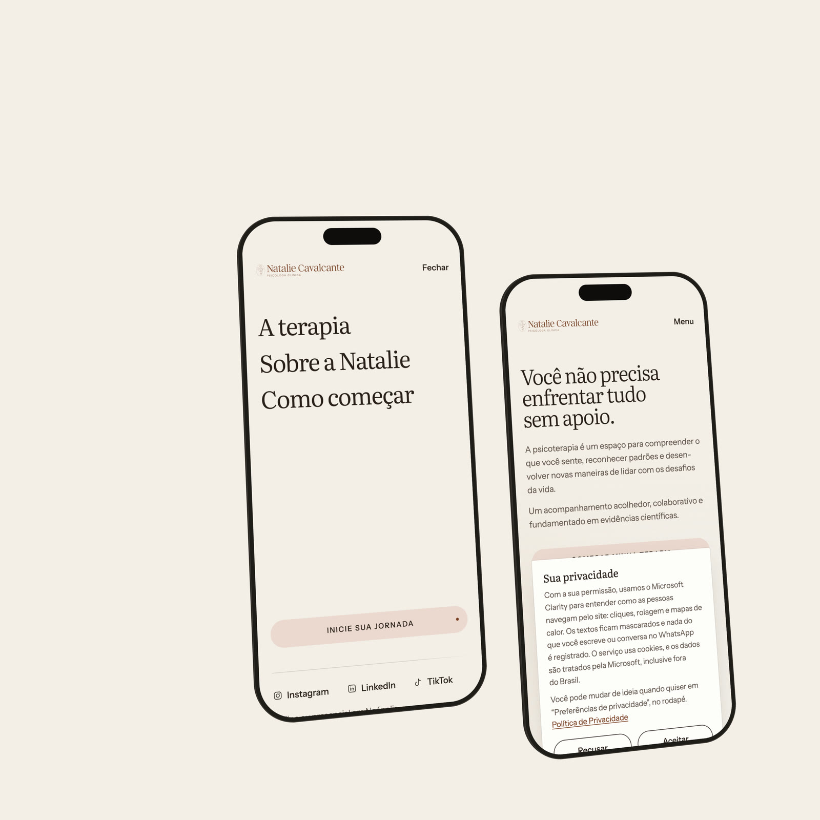
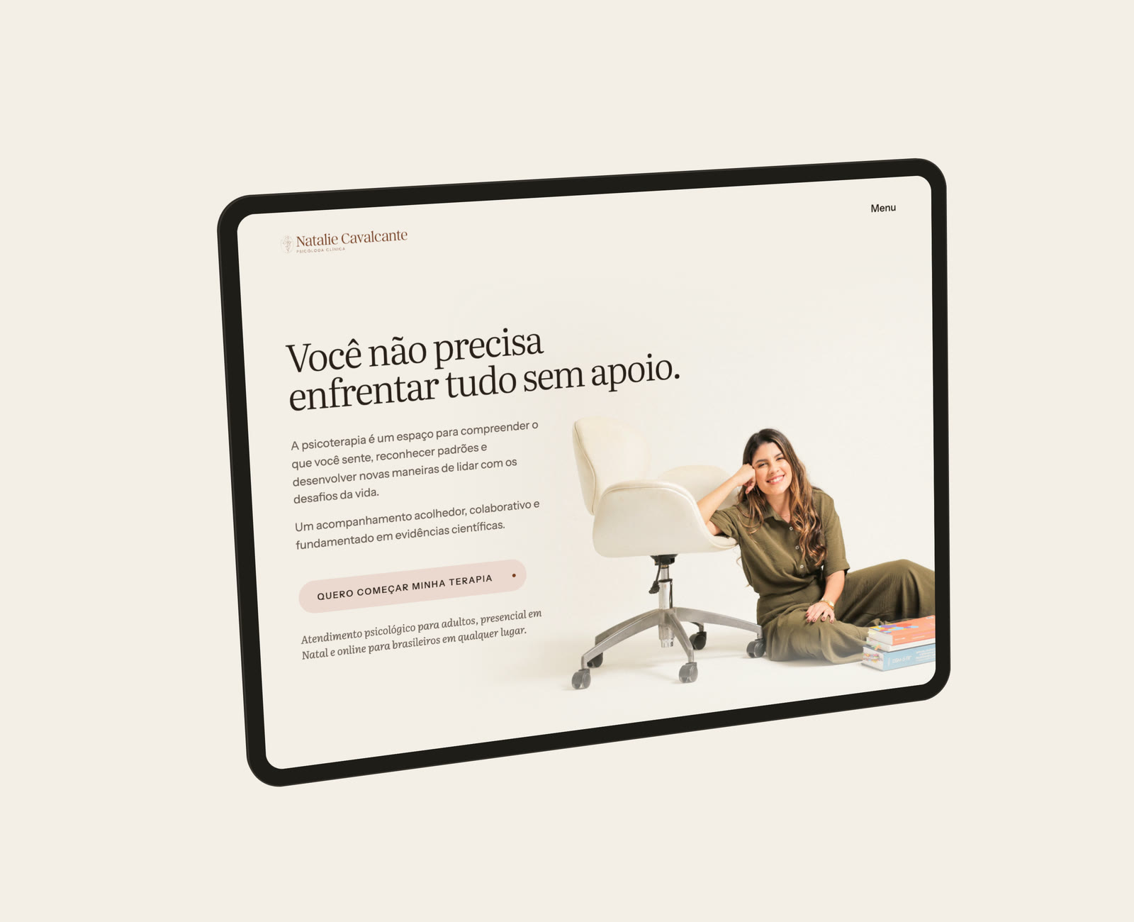
Interface details
Expressive restraint: motion appears only where it helps to understand what changed.
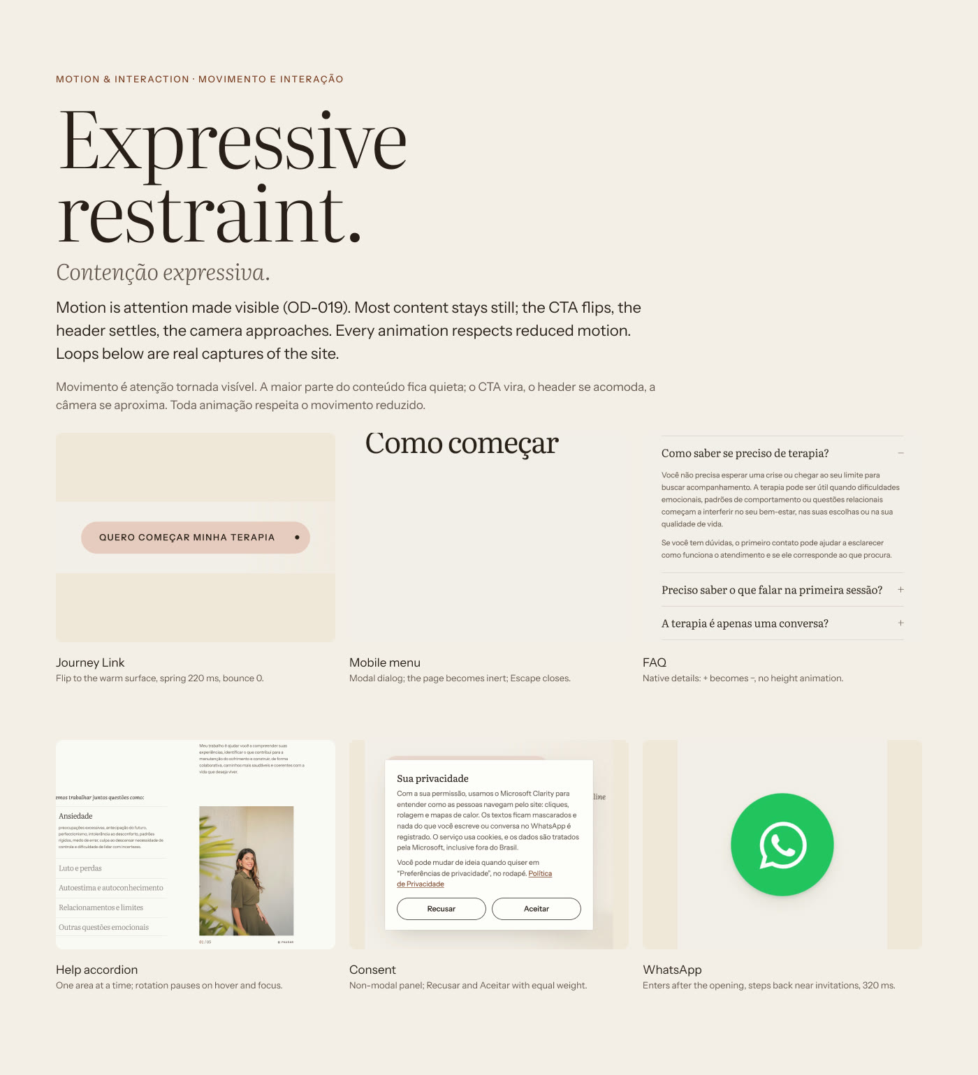
Credits
- Authorship
- Product design, art direction, design system and front end by Tatuí Tech. Shown in the portfolio with the client's permission.
- Editorial line
- Levize (2025)
- Photography
- Editorial shoot of Natalie Cavalcante, with AI-assisted light treatment and the face unaltered
- Technology
- Figma, Next.js, React, TypeScript, Tailwind CSS and Vercel
- Film
- Captures of the real website, with an instrumental score generated with ElevenLabs Music.
nataliecavalcante.com.br (opens in a new tab)